A Minimal PDF
Two identical pages that draw the structure of an invoice with lines and rectangles, without a word of text: the file is about a dozen kilobytes and embeds no font.
The page itself, the words on it, and the font — carried inside the file so the page looks the same everywhere.
A page has a size, like a sheet of paper, and words are placed on it. The font — the particular shape of the letters — is kept inside the document itself rather than fetched from whichever machine opens it.
That single decision is what makes a PDF worth sending. Give the file to a customer, a supplier or a printing works, and every one of them sees the page you laid out, in the font you chose, at the size you chose, whatever is installed at their end.
Two identical pages that draw the structure of an invoice with lines and rectangles, without a word of text: the file is about a dozen kilobytes and embeds no font.
The same document written twice: once as it is, once with its first page placed at the start of the file. The page gives, for each of the two, the number of bytes a browser must have received before it shows page 1.
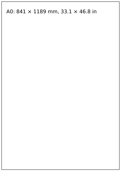
One page for each paper size the library names, from A0 down to A6 and the American sizes, each giving its size in millimetres and inches; then pages laid on their side or upside down, and a banner ten metres long.
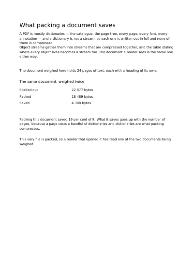
One document written twice: once uncompressed, once compressed. The page gives both file sizes and what the compression saved.
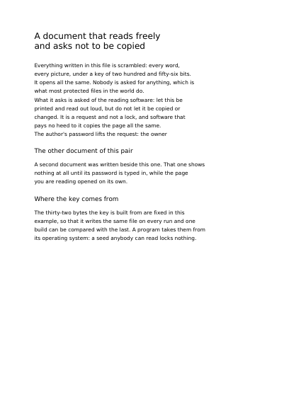
A page that opens without a password and prints like any other, but asks the reading software to forbid copying and pasting its text. The text is encrypted in the file: a program reading it byte by byte finds no sentence in it.
A page nothing shows until its password is typed in: no first line, no preview, no picture of it anywhere. The password is given on the example's page, to be tried.
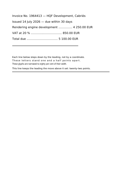
Text set in a font embedded in the file, cut down to the letters actually used, and still searchable, copyable and readable aloud.
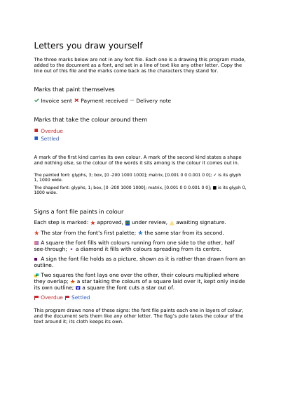
A tick, a cross and a dash drawn by the program, added to the document as a font, and set among ordinary words.
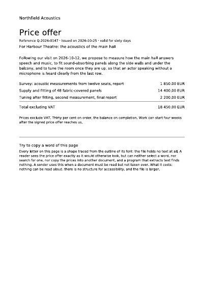
A one-page price offer whose every letter is a shape traced from its font: it reads as usual, but no word can be selected, searched, copied or extracted.
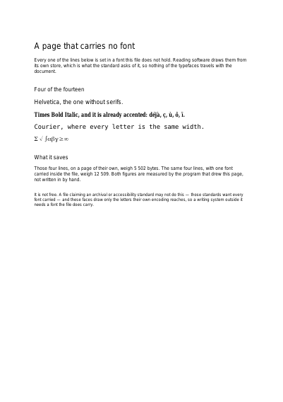
Four fonts all reading software draws on its own, set on a page that carries no font at all — and the example weighs the same lines both ways to say what that saves. Then the fourteen again, in free fonts of the same widths carried inside the file.
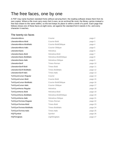
The twenty-six free fonts the library carries in place of the fourteen built-in ones, one page each: eight sizes, the same line in the built-in font and in the free one, and every character the font shows.
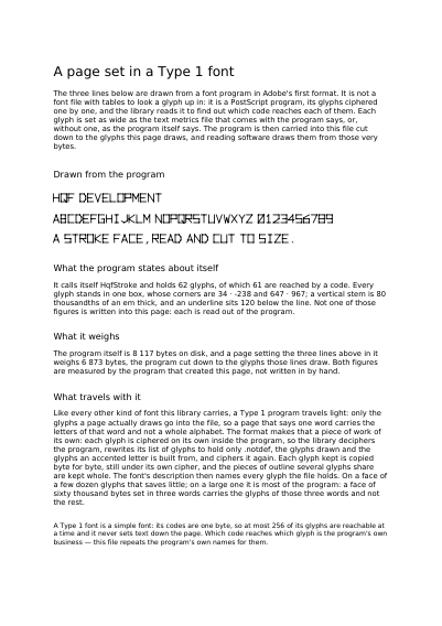
A font in Adobe's oldest format, the kind a print shop bought twenty years ago and almost nothing reads any more, cut down to the letters the page draws. Every figure the page states about it was read out of the font itself.
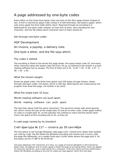
The same three lines written twice over — the ordinary way, then with each letter kept as a single byte — and the page states what each of the two came to. The short way also lets the space between the words of a line be set, which the ordinary way does not.
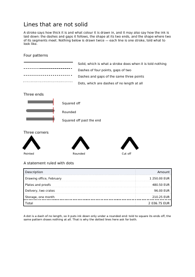
Dashes and dots, the shape of a line's ends, the shape of its corners: each drawn as one line under those settings. The statement at the bottom is ruled with dots, and its total held off by a dashed line.