A month's report, its charts drawn in curves
A pie of where the hours went, a ring gauge of how far into the year the work is, a card with eased corners, and arcs told where to go rather than how far to turn.
A gradient is the cheapest way to make a flat page look as though somebody designed it: a header that fades out, a bar with some depth to it, a panel that is not simply a rectangle of one colour. It is also the thing most often faked with an image, and the fake shows the moment the page is printed or looked at closely.
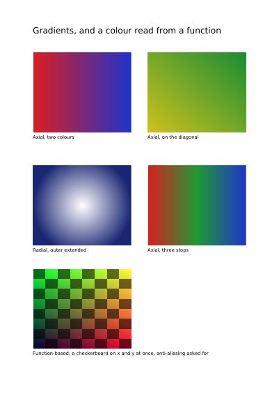
Four are on the page below, each named under it. A blend straight across is the workhorse: a header that fades out, a bar with some depth to it. The same blend on the diagonal costs nothing more and reads less like a default. A circular one is for a glow behind a name or a spotlight on a panel — and this one is carried out past its own circle, so the corners fill instead of staying empty, which is the slip that makes a circular blend look broken. The fourth passes through three colours rather than two, which is what a page needs when the two ends are too far apart to read as one sweep. Each is written into the document once, so the same blend used on twenty pages costs one description.
Nothing is left out and nothing is simplified: this is the program exactly as it runs, for the developer who uses this library. The third is the description itself: a plain list of what the page has to say, which is what the service is sent.
Read the Rust source Read the Python source Read the JSON source
A pie of where the hours went, a ring gauge of how far into the year the work is, a card with eased corners, and arcs told where to go rather than how far to turn.
The same area of stripes shown through two windows: a plain disc, and a ring whose middle is left bare.
Half-transparent fills that overlap and mix, one orange square laid over a blue bar in four different ways of mixing colours, and a line of overlapping letters painted two ways.
A gradient used as the colour something is filled with: a headline whose letters are windows onto a blend of three colours, and a panel filled with a circular one.
Six triangles round a centre they share, their edges stroked over the paint; a lattice of points in the four printing inks; a patch whose four sides are curves; and the same patch pulled about by four points inside it.
The same floor plan on six layers shown and hidden one at a time: the furniture and the distances shown, the internal notes hidden until asked for, and a draft watermark meant for the screen and not for the paper.