A month's report, its charts drawn in curves
A pie of where the hours went, a ring gauge of how far into the year the work is, a card with eased corners, and arcs told where to go rather than how far to turn.
A headline in a blend of colours belongs to a poster, a cover, a title page — and the usual way to get one is to build it in a drawing program and drop the picture in. The text then stops being text: it cannot be searched, it cannot be copied, and it cannot be translated without going back to whoever made it.
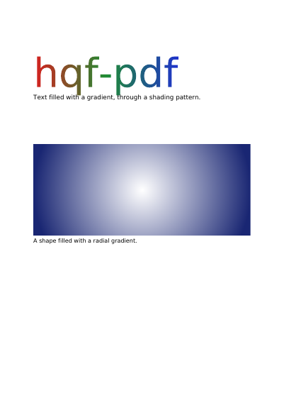
Here the letters stay letters: they can be searched, copied and translated, and the blend shows through them all the same. The gradient is pinned to the page, and each letter is a window onto the part of it lying behind. That is why the word reads as one sweep from end to end instead of the same little sweep repeated inside every letter — which is what a drawing program gives you, and what makes a headline look cheap. A shape is served the same way: the panel below is filled with a circular blend, and it is still a shape, not a picture of one.
Nothing is left out and nothing is simplified: this is the program exactly as it runs, for the developer who uses this library. The third is the description itself: a plain list of what the page has to say, which is what the service is sent.
Read the Rust source Read the Python source Read the JSON source
The document is lighter than it was, and every page still looks exactly the same. See this document's row in the table of every example.
A pie of where the hours went, a ring gauge of how far into the year the work is, a card with eased corners, and arcs told where to go rather than how far to turn.
The same area of stripes shown through two windows: a plain disc, and a ring whose middle is left bare.
Half-transparent fills that overlap and mix, one orange square laid over a blue bar in four different ways of mixing colours, and a line of overlapping letters painted two ways.
Five panels: a header that fades out, the same fade on the diagonal, a glow carried past its own circle so the corners fill, a blend that goes by way of a third colour, and a checkerboard whose colour is worked out from where each point stands, redder to the right and greener towards the top.
Six triangles round a centre they share, their edges stroked over the paint; a lattice of points in the four printing inks; a patch whose four sides are curves; and the same patch pulled about by four points inside it.
The same floor plan on six layers shown and hidden one at a time: the furniture and the distances shown, the internal notes hidden until asked for, and a draft watermark meant for the screen and not for the paper.