Breaking a paragraph up, and aligning it
A paragraph broken into lines, then laid out four ways: left, right, centred, justified.
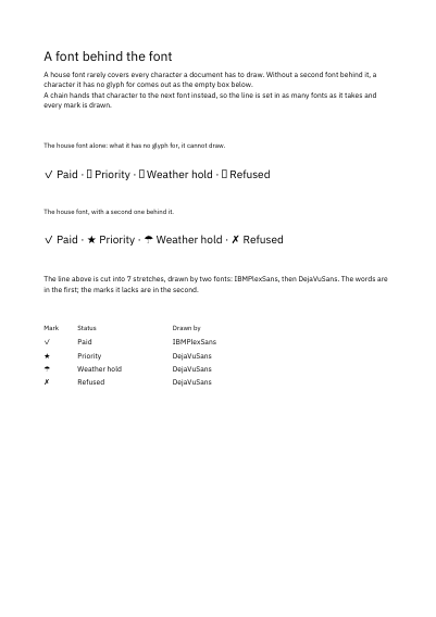
A company font rarely has a glyph for every character a document needs. A tick, a star, an umbrella: the font simply does not carry them, and where a glyph is missing the reading software leaves an empty box. The trouble is that the hole passes in silence. The page looks finished, the run goes out, and it is the customer who finds the hole — in the one status line out of forty that happens to use the symbol.
Behind means exactly that: the company font draws everything it can, and every character it has no glyph for is handed to a second one standing behind it. The line ends up drawn in two, and the small list at the foot of this page says which drew which character. The line does not grow taller for it either — its height stays the first one's — so a page never changes its rhythm because one symbol came from elsewhere.
Nothing is left out and nothing is simplified: this is the program exactly as it runs, for the developer who uses this library. The third is the description itself: a plain list of what the page has to say, which is what the service is sent.
Read the Rust source Read the Python source Read the JSON source
A paragraph broken into lines, then laid out four ways: left, right, centred, justified.
A word longer than the column that holds it: the library leaves it whole, or cuts it at the column's edge.
A justified column set twice: the long words breaking at their soft hyphens with a hyphen shown, or left whole, and a figure a no-break space keeps together.
A justified column set twice: file paths and compounds running past the edge with no break points, then wrapping where a break after a slash or a hyphen is allowed.
A title, a rule, two paragraphs, a heading, a table of twenty-six rows and a footnote, handed over in reading order and broken across two pages by the engine.
Four samples set twice each, once plain and once with a single setting activated: joined letters, small capitals, figures that hang below the line, and pairs moved closer together.