Breaking a paragraph up, and aligning it
A paragraph broken into lines, then laid out four ways: left, right, centred, justified.
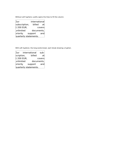
A narrow justified column goes loose as soon as its words are long: the spaces stretch, channels of white run down the page, and the eye falls into them instead of reading. What sets the page right today, and costs nothing, is to say inside the text itself where a particular word is allowed to break (automatic word-breaking, with a dictionary behind it for each language, is planned for a future version).
Such a character is invisible until it is needed: it stays out of the way, and a hyphen appears only on the line that actually breaks there. Its opposite is on the page too — a space that refuses to break, set inside the figure 1 200 EUR, which keeps the amount and its currency on one line however narrow the column gets. Neither character shows up in the finished document; both are read out of the text itself.
Nothing is left out and nothing is simplified: this is the program exactly as it runs, for the developer who uses this library. The third is the description itself: a plain list of what the page has to say, which is what the service is sent.
Read the Rust source Read the Python source Read the JSON source
The document is lighter than it was, and every page still looks exactly the same. See this document's row in the table of every example.
A paragraph broken into lines, then laid out four ways: left, right, centred, justified.
A word longer than the column that holds it: the library leaves it whole, or cuts it at the column's edge.
A justified column set twice: file paths and compounds running past the edge with no break points, then wrapping where a break after a slash or a hyphen is allowed.
A title, a rule, two paragraphs, a heading, a table of twenty-six rows and a footnote, handed over in reading order and broken across two pages by the engine.
One line of statuses set twice: in a company font alone, where the characters it has no glyph for come out as empty boxes, then with a second font behind it that draws them.
Four samples set twice each, once plain and once with a single setting activated: joined letters, small capitals, figures that hang below the line, and pairs moved closer together.